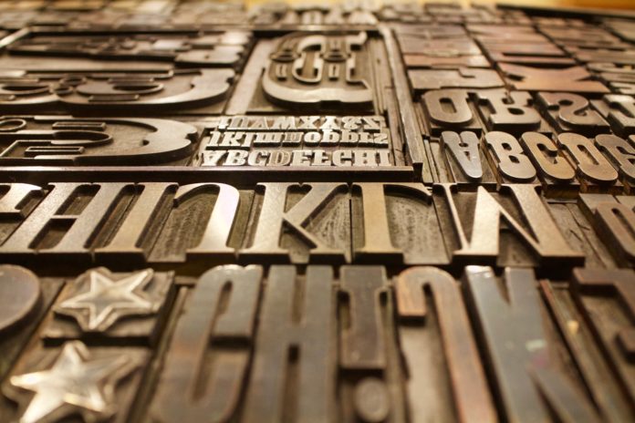
Pixel, percentage, and em are some indicators of the size of a font. The graphic designers preferably use em as it gives accuracy, and provides a high level of control than pixel and percentage.
Some techniques, such as leading and kerning, are applied in Word. Leading is the line spacing, and kerning is the uniform letter spacing. The measure is the width of the written text. A right proportion of measure is appreciated. A too-long measure can confuse the reader and make him get lost, and a too short measure can disturb the reader as it causes useless breakage of the text. By using headings, weight, and text color, one can achieve hierarchy.
A source of communication
Words have the ability to say everything. As soon as you search for a website, its logo and typography can tell you as much about the site as they can. They tell what about the site is and about the product. Logos have a strong power to inspire people to do something. People usually don’t consider this but they can find the right font online for free if they look for free fonts.
The right typography is indicated by the power it has in conveying the message without misleading the reader. Typography conveys feelings or a mood such as the comic sans font helps convey a playful mood.
Attracting the reader and holding their attention
Typography can capture the reader and have the power to hold his attention.
Fonts do not only enhance the value of your text but also makes the readers extract the required information from the text. Choosing the right color, font, and text size can attract the targeted audience. You should know to attract readers through creative techniques. Stressing on the important parts of the text can make the text look attractive.
Conveys a particular mood or feeling
Typography is different for each kind of website. Industrial corporations, design firm, and kid’s websites have different typography from each other. By knowing the industry of a website, you can control the typography so you can convey the required mood or feeling. A computer game will focus on the design that is fun and playful for the kids.
Corporate websites that concern with genuine serious issues should focus on choosing simple and professional fonts. The seriousness of content can entirely depend on the choice of the font.
Establishing an information hierarchy and creating harmony
Information hierarchy is to arrange and categorize the written text according to the order of their importance. Multiple different font types and font sizes can be used to create visual discrimination and to make the most important part of the text prominent.
One way to highlight the most critical topics is to use a bigger font size. It becomes easy for users to extract the required information.
The harmonic designs enhance the creativity of your website. Ideal typography creates synchronization between the text and the image. The use of simple fonts makes your content simple and gives continuity to your text. Harmony in font spacing increases the neatness of your text.


