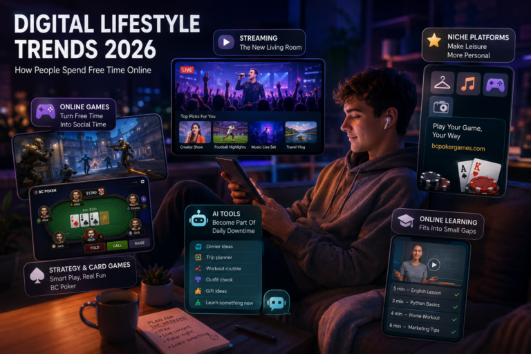
Gaming on a phone used to mean one of two things: a basic puzzle to kill time, or a “real” game squeezed into a small screen with too many buttons. That split is disappearing. Mobile entertainment apps have started to behave like mini platforms, mixing games, live content, social features, and payments into one continuous experience.
A good example of where this is heading can be seen in products that lean into live, hosted play, such as the tamasha bet live casino online app. The point is not one app or one category. It’s the playbook: make gaming watchable, make it interactive, and make it fit into the kind of day people actually have.
The big shift: apps are no longer “games,” they’re channels
The most successful mobile entertainment apps aren’t trying to be a single title anymore. They’re trying to be a place people open by default, the way they open a streaming service or a social feed.
That changes how gaming is packaged:
- Sessions are shorter and easier to start
- Content refreshes constantly, like programming
- Social proof is visible, even if users never chat
- The app learns what a user does, then quietly rearranges itself
It’s closer to running a digital venue than the old “ship a game, patch it monthly” model.
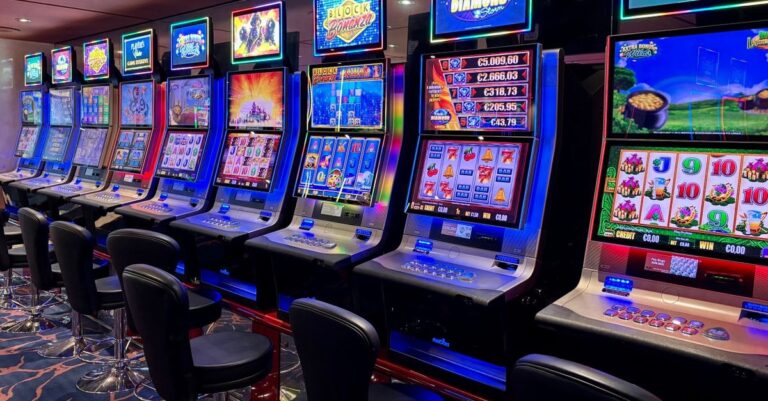
Live, interactive play is dragging gaming into the “watchable” era
Mobile screens are small, but people still spend hours watching them. Video became the default format online, and gaming has been pulled along with it.
Live casino is one of the clearest examples: real dealer on camera, real table, real-time outcomes, optional chat. But similar mechanics show up outside casino walls too: live trivia, hosted game shows, timed community events, influencer-led challenges.
Why this works on mobile
- It reduces loneliness: a live table has a pulse.
- It teaches by showing: users can watch before committing.
- It creates natural stopping points: rounds end cleanly, so leaving feels easy.
Instant access is quietly beating the app-store model
App installs are friction. Modern entertainment apps respond with lighter entry paths: browser-first experiences, webviews, PWAs, smaller downloads, faster onboarding. The goal is to reduce time between “interesting” and “playing.”
Mobile intent is fragile. If curiosity lasts ten seconds, waiting for an install kills it. Lightweight products also scale better globally, across devices and networks.
UX has gotten practical, and that’s why it works
The new wave of apps wins by being usable, not just pretty.
Thumb-first layouts
Big tap targets, clean controls, fewer tiny icons.
Fewer screens between intent and action
Promotions don’t block play.
Clear status and feedback
Readable loading indicators, responsive buttons, transparent transaction statuses.
Mobile users don’t forgive confusion. They leave.
Payments, withdrawals, and identity checks are part of entertainment
Money movement is judged like any other UX. If deposits or withdrawals feel messy, trust collapses.
Better apps consistently:
- Show limits upfront
- Offer local payment methods
- Explain verification early
- Provide readable transaction histories
Payments are now front-stage, not back-office.
Social features are lighter but more effective
Modern apps use “ambient social”:
- Leaderboards that refresh often
- Optional live chat
- Quick reactions and emotes
- Visible activity signals
This supports discovery too: clips, screenshots, quick shares spread games faster than store browsing.
Personalization is shifting from taste to timing
Apps now personalize around context:
- Short formats for short sessions
- Offers timed to user behavior
- Avoiding modes users skip
- Dialing back interruptions if users quit after popups
It feels like the app “gets it,” which keeps users longer.
What’s new in the mobile entertainment playbook
- Live-hosted formats that make play watchable
- Instant access options that reduce install friction
- Mobile-first UX for one-handed use
- Smarter payments and clearer withdrawals
- Lightweight social layers
- Personalization based on session length and behavior
The part nobody wants to talk about: engagement can get messy
Retention tactics can cross into pressure tactics. Warning signs:
- Constant “limited time” banners
- Popups every minute
- Confusing bonus rules
- UX that makes starting easy but stopping hard
Responsible platforms offer limits, reminders, cooling-off options, clear histories.
How to choose a mobile entertainment app
Look for:
- Fast loading on mobile data
- Clear rules and visible limits
- Transparent transaction history
- Plain withdrawal timelines
- Adjustable notification settings
- Easy support access
If basics are hidden, the app is telling on itself.
Where this is heading next
Mobile entertainment apps are becoming all-in-one ecosystems: live content, instant play, short sessions, social discovery, smooth payments. The winners will feel effortless, trustworthy, and designed for messy schedules. Mobile didn’t just shrink gaming. It reshaped it around speed, presence, and convenience.