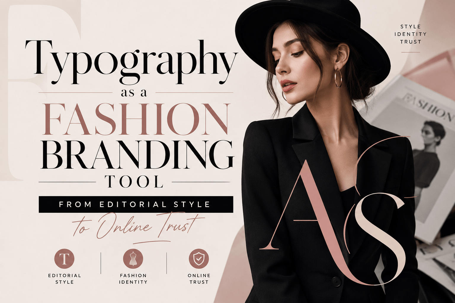
Fashion has always been visual, but fashion communication is built with text as much as images. A reader scans a trend story, checks a product description, compares sizing advice, saves a beauty routine, or decides whether a lifestyle brand feels trustworthy enough to follow. Typography shapes all of those moments.
For fashion magazines, beauty blogs, ecommerce boutiques, personal style creators, and lifestyle brands, fonts are becoming part of the brand experience. A clear type system can make a fashion article easier to read, a campaign more recognizable, and a product page more credible. Poor typography can make even stylish content feel scattered.
This trend fits the way fashion now lives online. Style inspiration moves between websites, newsletters, Instagram graphics, shopping pages, video captions, lookbooks, and product packaging. The font choices behind those touchpoints should make the brand feel intentional while keeping the information easy to understand.
Why typography matters in fashion and lifestyle content
Fashion readers often browse quickly. They may be comparing outfit ideas on a phone, checking a beauty product before buying, reading a trend guide during a commute, or saving a lifestyle article for later. Typography needs to support both mood and clarity.
· make headlines feel distinctive without becoming hard to read
· keep product details, prices, and sizes clear
· make editorial stories more comfortable on mobile
· help newsletters, social posts, and web pages feel connected
· support transparency in sponsored content and product reviews
· give small fashion brands a more professional visual voice
| Content type | Typography challenge | Better design response |
| Trend article | Readers scan names, garments, seasons, and examples | Clear subheads, short paragraphs, and readable body text |
| Product page | Price, size, material, and care details compete for attention | Readable tables, strong numerals, and visible labels |
| Beauty review | Ingredients and claims need careful reading | Plain body text, consistent captions, and clear hierarchy |
| Lookbook or campaign | Mood matters, but details still need clarity | Expressive display type supported by simple text |
| Newsletter | Readers decide quickly whether to keep scrolling | Recognizable headings and comfortable spacing |
Fashion style needs structure as much as expression
Fashion typography often leans into personality: elegant serifs, condensed display fonts, handwritten details, minimalist sans serifs, or dramatic editorial headlines. These choices can create a strong mood, but they should not carry every part of the message.
A magazine-style headline can be expressive. A product description, sizing note, return policy, or ingredient list should be easy to read. The strongest fashion brands usually separate typographic roles instead of forcing one font to do everything.
| Expressive style | Practical typography |
| Large editorial headline | Readable body text underneath |
| Decorative campaign lettering | Plain product details and pricing |
| Dramatic social graphic | Clear caption and link text |
| Luxury-inspired logo style | Accessible website navigation |
| Trend-led seasonal font | Stable brand system across campaigns |
Commercial and custom fonts both have a role
Not every fashion blog, boutique, or creator brand needs a custom typeface. Many can build a polished identity with a professional commercial font family. Custom typography becomes more useful when a brand grows across websites, ecommerce, packaging, apps, ads, printed lookbooks, newsletters, and retail environments.
| Font option | Best for | Main risk |
| Free fonts | Early concepts, personal blogs, simple social graphics | Overuse or unclear commercial rights |
| Open-source fonts | Accessible projects and simple websites | Still requires license review |
| Commercial fonts | Professional fashion sites, ecommerce, campaigns, and lookbooks | Requires budget and license tracking |
| Variable fonts | Responsive websites and flexible editorial layouts | Needs careful implementation |
| Custom fonts | Established brands, apps, product lines, and fashion publishers | Higher cost and longer timeline |
Fashion teams comparing professional font families, variable fonts, or custom typography options can review foundries such as typetype.org when they need type systems that can be tested across websites, ecommerce pages, newsletters, packaging, campaigns, and brand materials.
Font licensing should be part of fashion brand planning
Font licensing is easy to overlook because fonts feel like creative assets. Legally, however, fonts are software. A license defines where and how a typeface may be used. A fashion brand may use the same font on a website, product label, Instagram campaign, video, paid ad, lookbook PDF, mobile app, or packaging.
| Use case | Licensing question |
| Website | Can the font be embedded as a webfont? |
| Ecommerce product page | Are commercial web uses covered? |
| Logo or fashion label | Is wordmark use permitted? |
| Packaging and tags | Are commercial print uses covered? |
| Lookbook PDF | Can the font be embedded in downloadable files? |
| Paid social campaign | Are ad and campaign graphics covered? |
| Merchandise | Can the font appear on products for sale? |
| Contractors | Can font files be shared with agencies or freelancers? |
Common licensing mistakes
· using a personal-use font in a commercial campaign
· using a desktop license as if it were a webfont license
· embedding fonts in an app or digital product without app rights
· sending font files to contractors without permission
· including fonts inside editable templates
· modifying letters without checking the EULA
· losing license receipts before a rebrand or brand partnership
Typography mistakes that weaken fashion content
Most typography problems happen when a design is judged only by mood. Real fashion content has to survive small screens, fast scrolling, product grids, long captions, sponsored disclosures, and ecommerce details.
· using decorative fonts for product descriptions or size charts
· making mobile body text too small
· using unclear numerals for prices, discounts, dates, or measurements
· mixing too many typefaces in one campaign
· placing low-contrast text over editorial photography
· hiding captions, affiliate notes, or sponsorship disclosures in tiny text
· changing fonts between the site, newsletter, and social templates
· treating font licensing as a final detail
| Better choice | Why it helps |
| Readable body font | Supports articles, reviews, guides, and product descriptions |
| Clear numerals | Improves prices, discounts, sizing, dates, and measurements |
| Consistent captions | Makes photo-led content feel more polished |
| Distinct display style | Adds fashion personality without hurting long reading |
| Documented license | Reduces brand and campaign risk |
What this means for fashion and lifestyle teams
| Team or brand | Typography can support |
| Fashion magazine | Readable trend stories, interviews, reviews, and newsletters |
| Ecommerce boutique | Product descriptions, size charts, checkout, and emails |
| Beauty brand | Ingredient lists, claims, packaging, and social campaigns |
| Stylist or creator | Media kits, guides, social templates, and personal branding |
| Lifestyle publisher | Editorial hierarchy, captions, affiliate content, and sponsored posts |
| Brand designer | Consistent identity across digital, print, and packaging |
The encouraging part is that better typography does not require a huge rebrand. A simple system with one readable body font, one strong display style, clear numerals, consistent spacing, and proper licensing can already make a fashion brand feel more professional.